Small changes lead to great results—especially when you're trying to turn a basic treatment room into a zen den that clients practically levitate out of. You might think picking out a new spa bed is the hard part (spoiler: it is, because there are so many gorgeous options), but here's the plot twist: the color of your walls is the bossy older sibling telling that fancy furniture what to do. Ignore that dynamic, and you end up with a room that feels like a bad first date—everything is technically nice, but something is just... off. The truth is, the relationship between your wall color and your furniture materials isn't just about aesthetics; it's about the vibe, the durability, and whether your clients feel like royalty or just a little confused. So, grab your color swatches and your shopping list—we're about to play interior designer without the hefty consulting fee, because here at Pure Spa Direct, we want your space to look as flawless as the services you offer.
Before we dive into the nitty-gritty of wood grains versus vinyl, let's talk about why this matters beyond just looking pretty on Instagram. Think of your wall color as the lead singer in a band and your furniture as the backup vocals. If the lead singer is screaming heavy metal (hello, neon orange accent wall), your sleek, minimalist black manicure station is going to look like it showed up to the wrong concert. The goal is harmony, not a cacophony of design choices that leave your clients stressed before you even touch them. We're building a sanctuary, folks, not a funhouse. The materials you choose for your salon furniture—whether it's the leather on your styling chairs or the wood finish on your reception desk—have a conversation with the paint on your walls. Our job is to make sure that conversation is a soothing whisper about luxury and relaxation, not a shouting match about whose texture is more interesting.
Setting the Stage: Why Your Wall Color is the Real MVP
Alright, let's get one thing straight: picking a wall color is an emotional journey. It's the backdrop for every single transformation you perform. If you're going for a calm, earthy vibe—which, as of 2025, is all the rage with colors like Mocha Mousse and Cinnamon Slate, according to the design gurus —you need furniture that doesn't fight that cozy energy. Warm, grounding neutrals scream for furniture materials that feel organic and substantial. Think about it: a deep, earthy brown wall is basically begging for the rich texture of natural wood or the sophisticated feel of genuine leather. Pair that with a massage table upholstered in a warm, caramel-toned faux leather, and you've just created a space that smells like a million bucks (even if your aromatherapy diffuser is currently just spritzing water).
On the flip side, maybe you're going for a crisp, clean, and modern aesthetic. You've got those sleek, white walls that make the space feel twice as big and ten times brighter. Now, if you put a bulky, dark wood cabinet in there, it might look like a majestic boulder in a minimalist art gallery. It's not wrong, but it is loud. This is where your material choices get to play the starring role. Light walls are like a blank canvas; they love materials with personality. Consider a reception desk in a cool, polished quartz or a high-gloss laminate. The clean lines and reflective surface will sing against the white backdrop. Or, if you want to add a touch of industrial chic, metal accents like brushed nickel or matte black on your barber chairs will pop against the neutrality and look incredibly intentional. It's like wearing a little black dress—you can dress it up with any accessory, and here, the accessories are your furniture materials.
The Texture Tango: How Materials React to Color
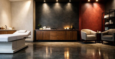
This is where we get into the juicy stuff. It's not just about whether the colors match; it's about how the texture of your furniture interacts with the hue on the walls. Let's take wood, for instance. Wood is like that friend who gets along with everyone, but its mood changes based on who it's hanging out with. If you have walls painted in a cool, serene blue or a soft grey, a light oak or ash finish will feel fresh, airy, and Scandinavian . It’s a vibe of clean, calm efficiency—perfect for a nail station where precision is key. But take that same light wood and put it against a warm, terracotta wall? Now it feels more rustic, organic, and a little boho. It’s a subtle shift, but your clients will feel it. Meanwhile, a dark, rich walnut or mahogany is a drama queen—in the best way. Against light walls, it creates a stunning contrast that screams luxury and anchors the room. Against dark, moody walls? It can either blend in seamlessly for a super cozy, den-like feel, or it can look like a dark abyss if you're not careful. So, if you're planning a dark, dramatic color scheme, consider a wood with a lighter grain or a visible texture to keep things from looking too flat .
Then, there's the whole metal situation. Metal is the cool kid of materials. It’s sleek, it's modern, and it doesn’t try too hard. But its entire personality changes based on the color around it. Warm metals like copper and brass are having a major moment, and for good reason. When placed against a deep green or navy blue wall, they look rich, historic, and incredibly regal . They add that pop of warmth and a sense of understated opulence. Think about copper detailing on your wax warmers or a brass frame on your magnifying lamp—it elevates the whole experience. On the other hand, stainless steel or chrome are the ultimate team players. They love clean, neutral palettes—whites, greys, blacks. They reinforce a minimalist, clinical aesthetic that screams "sterile and professional" (in the best way possible for a laser tattoo removal suite or a high-tech facial room). Put chrome against a bright, sunny yellow wall, though, and suddenly you're in a retro diner, which might not be the vibe you're going for unless you also serve milkshakes.
Upholstery: Where Butt Meets... Well, You Know
Let's talk about where the magic (and the sitting) happens. Your upholstery choices—leather, faux leather, fabric—are the most tactile part of your furniture, and they need to get along with your wall color on a deeper, more personal level. Genuine leather is a classic for a reason. It's durable, it looks high-end, and it ages like a fine wine . But here's the thing: leather has undertones. A cool-toned black leather on your barber chairs will look sharp against a cool grey wall, but it might feel a bit severe against a warm beige. A warm, cognac-colored leather, however, is a dream against almost any earthy tone—greens, browns, terracottas—and it even adds a surprising pop of warmth against a crisp white wall. It’s like the perfect handbag: it goes with everything.
Now, let's give a round of applause for our best friend, faux leather (or vinyl). This material is the unsung hero of the spa and salon world because it's durable, easy to clean, and comes in every color under the sun . This is where you can get a little playful. If your walls are a neutral canvas, a pop of color on your pedicure chairs in a dusty rose or a sage green can add personality without overwhelming the space. But if your walls are already bold—say, that trendy Mocha Mousse—stick with neutral upholstery. A cream or taupe faux leather massage table will look sophisticated and allow the wall color to shine without causing visual chaos. The key is balance: one element is the star, the other is the supporting actor.
What about fabric? Fabric is the coziest option, but it's also the high-maintenance friend. It's perfect for waiting room chairs where clients want to sink in and feel at home. If you have a soft, serene blue wall, a fabric chair in a complementary pattern or a textured weave like boucle adds a layer of comfort that hard surfaces can't replicate . However, a word to the wise: in high-traffic or service areas where spills happen (looking at you, hair color and waxing zones), fabric can be a nightmare. It absorbs stains, holds odors, and requires constant maintenance. So, if you love the cozy look of fabric but need the practicality of a workhorse, consider using it sparingly—like on accent pillows or in the reception area—and stick with easy-clean surfaces where the actual work happens .
Specific Rooms, Specific Needs: It's Not One-Size-Fits-All
Let's get practical, because a lash room has very different needs than a pedicure suite. In a waxing room, your walls are likely a calming, neutral color to help clients relax (because, let's face it, no one is relaxed when they're about to get waxed). Your furniture here needs to be a fortress of durability. You'll want materials that are non-porous and easy to sanitize. This is where high-quality vinyl or faux leather on your waxing tables is non-negotiable. The color of the upholstery should contrast just enough with the wall so you can see what you're doing (no black wax on a black table against a black wall, please—that's a disaster waiting to happen). A soft, light beige table against a deeper taupe wall creates a clean, professional look and makes it easy to spot any stray drips of ItalWax.
In a nail salon, you're dealing with a lot of dust, chemicals, and constant motion. Your walls might be bright and trendy or sleek and modern. But your nail tables and chairs are the workhorses. Here, you want materials that are not only stylish but also incredibly durable against acetone and other solvents. Faux leather is your best friend here because it's a breeze to wipe down . Consider a darker color for your pedicure chairs if your floors are light—it hides the wear and tear of foot traffic and any accidental polish drops. And don't be afraid to use metal accents! A chrome base on a chair or a metal side table can add a touch of modern elegance and is easy to sanitize between clients. The wall color here should complement, not compete, with the details on your equipment. If your nail tables have a wood-grain laminate, a soft grey or a warm white on the walls will make that grain stand out without feeling dated.
For the massage therapy and facial rooms, the goal is total zen. These rooms are all about promoting relaxation and a sense of escape . Your wall colors will likely be soft, muted, and natural—think calming blues, gentle greens, or warm, earthy neutrals. Your furniture choices here need to support that. Massage tables are often upholstered in neutral creams and browns for a reason: they go with everything and create a sense of calm. For facial beds, you might opt for a luxury spa furniture piece with a high-quality, stain-resistant vinyl in a creamy hue. The materials in these rooms should feel soft and welcoming to the touch, and the colors should be a cohesive, soothing palette. Adding natural wood elements—like a wooden aromatherapy diffuser or a bamboo side table—can enhance the organic feel and tie the whole space together .
Making It All Work: A Little Strategy Goes a Long Way
So, how do you put all this into practice without losing your mind? Start with your wall color as your anchor. Once you've picked that perfect shade—whether it's a bold statement or a subtle whisper—use it to guide your furniture material choices. If your walls are warm, lean into furniture materials that have warm undertones: woods like walnut or cherry, metals like brass or copper, and upholstery in creams, tans, or warm greys. If your walls are cool, embrace cool materials: light oak or ash, chrome or stainless steel, and upholstery in crisp whites, charcoals, or jewel tones like sapphire or emerald.
And please, for the love of all that is holy, think about your lighting! The color temperature of your lights will change how both your wall color and your furniture materials look . A warm, yellow-toned bulb can make a cool grey wall look muddy, while a cool, blue-toned LED can suck all the warmth out of a beautiful cognac leather chair. If you're using warm wall colors, warm lighting (2700K-3000K) is your best friend. For cool, crisp spaces, you might want a more neutral white light (3500K-4100K) to keep everything looking sharp and true to color.
Here at Pure Spa Direct, we're not just about selling you the stuff; we're about helping you create a space that works as hard as you do. We've got thousands of products to choose from, and we know it can feel overwhelming. But when you understand the relationship between your walls and your furniture, suddenly everything clicks into place. You start to see that the wax warmer isn't just a wax warmer—it's a style opportunity. The towel steamer isn't just functional—it's a design element.
So go ahead, get that paint swatch. Daydream about the perfect ItalWax setup. And when you're ready to pull it all together, remember we're here with the high-quality gear that will make your vision a reality. Your clients are going to walk in, take a deep breath, and feel that perfect harmony between the warm, welcoming walls and the luxurious, functional furniture. And you? You're going to look around and think, "Yeah. I did that." And then you're going to go book yourself a massage because, let's be honest, you've earned it.
)