Solutions made for professionals... who understand that a client doesn't walk in asking for "Pantone 14-0957." They arrive carrying a week's worth of stress, dreaming of tranquility, or craving a burst of confidence for a big event. They speak the language of emotion, not swatches. As we navigate 2025, where personalization and holistic wellness reign supreme, the ability to translate those intangible feelings into a tangible, cohesive experience is your ultimate superpower. And the secret weapon for that translation? The Color Mood Board. This isn't just an arts and crafts project; it's a strategic business tool that bridges the gap between a client's heart and your service menu, fostering trust and delivering truly bespoke results. Forget forcing clients to choose from a sterile color chart; let's build a visual story that captures the essence of how they want to feel. Let's turn "I need to relax" into a serene palette of soft blues and gentle greens, and "I want to feel powerful" into accents of deep plum and metallic gold. Ready to become a master translator of vibes? Let's dive in.
Think of a mood board as the ultimate "show, don't tell" tool for your consultation. It's a curated collage—digital or physical—that gathers images, textures, words, and, most importantly, colors that embody a specific feeling or atmosphere. For our industry, it moves the conversation beyond "short or long?" and into the transformative realm of "calm or energized? Sophisticated or playful?" When a client points to an image of a misty forest floor and says, "That peace, that's what I need," you're no longer guessing. You have a direct line to their desired emotional outcome, which you can then map to specific services, product lines, and even the ambiance of your treatment room. It's about creating a consistent, multi-sensory brand experience for that individual client.
Why Bother? The Business Psychology of Color and Emotion
This isn't fluffy stuff; it's neuroscience and smart business. Our brains process color information incredibly fast, forming impressions within milliseconds. The colors in your space, your branding, and the visual cues you use during a consultation silently communicate your brand's promise before a single word is spoken. Studies suggest a huge percentage of snap judgments about products are based on color alone. By intentionally using color psychology, you're not just decorating; you're strategically guiding your client's emotional journey.
Color can literally alter perception. Cool tones like blues and greens are known to promote calm and can even make time seem to pass more quickly—a perfect trick for a waiting area. Warmer tones like soft coral or peach can create an inviting, energizing atmosphere that sparks creativity in a styling chair. A cohesive color strategy can reduce client anxiety, increase their perception of value, and build deeper trust in your expertise. In short, speaking the color-emotion language isn't just nice; it's a competitive edge that boosts client satisfaction and loyalty.
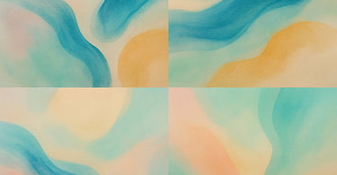
The Emotion-to-Color Dictionary: A Starter Guide for 2025
Before you start gluing pictures to a board, let's decode the basics. Here's a quick guide to the emotional whispers of different color families. Remember, these are general associations—the magic happens when you combine them and adjust their tone based on your client's unique story.
For the "Calm My Soul" Client: Think Blues & Greens. Soft sky blue evokes trust, calm, and serenity. Sage or muted green connects to nature, renewal, and harmony. These are your go-tos for massage therapy rooms, facial treatments, and anyone seeking deep relaxation. Pair with imagery of calm water, mossy stones, or open sky.
For the "Ground and Center Me" Client: Think Earthy Neutrals. Warm beiges, taupes, and soft browns convey stability, simplicity, and organic warmth. They form a perfect, grounding base. Deep olive green adds natural depth and a sense of restorative health. Ideal for holistic wellness, sugaring services, or clients seeking a "back to basics" vibe. Pair with images of textured linen, dry grasses, or smooth pottery.
For the "Pamper and Luxuriate Me" Client: Think Dusty Purples & Muted Metallics. Lavender and dusky plum have long been tied to luxury, royalty, and a touch of spiritual mystery. Champagne gold or warm brass adds sophistication and a touch of opulence. Perfect for high-end lash lift clients, VIP treatment packages, or anyone wanting to feel utterly indulged. Pair with velvet textures, soft candlelight, or art deco details.
For the "Energize and Uplift Me" Client: Think Sun-Washed Corals & Gentle Yellows. Peach and soft coral radiate warmth, cheerfulness, and approachable energy. Pale butter yellow promotes optimism and communication. Use these as accents to invigorate without overwhelming. Great for a stylist's station, a bridal party prep area, or a client needing a mood boost. Pair with images of sunrise, citrus fruits, or sun-drenched textiles.
Your 5-Step Blueprint to Building the Perfect Service Mood Board
Okay, theory is great, but let's get practical. How do you actually do this during a busy day? Follow this simple blueprint to create mood boards that convert feelings into flawless service plans.
Step 1: The Deep Dive Conversation (Ask the Right Questions). Skip "What color?" Start with "How do you want to feel when you walk out of here?" or "Describe your ideal state of mind." Listen for words like serene, powerful, refreshed, playful, sophisticated, clean, natural. These are your keywords.
Step 2: Rapid-Fire Curation (Gather Your Visuals). Use a free tool like Canva or Pinterest, or keep a physical binder with categorized images. Have folders or sections pre-loaded with images that correspond to core emotions: beaches for calm, forests for grounding, art galleries for luxury, bustling cafes for energy. Let your client scroll or flip and point to what resonates. Their choices are the data you need.
Step 3: Translate Visuals to Services (The Magic Mapping). This is where your expertise shines. If their selected images are all cool, misty, and blue-toned, you're building a De-Stress Package. "Based on these beautiful calming visuals, I recommend we start with a lavender aromatherapy infusion during your hot stone massage, followed by a hydrodermabrasion facial for that dewy, refreshed glow you're drawn to here. We can finish with a cooling cuticle oil in a serene green shade." You've just created a custom, multi-service plan that feels utterly personal.
Step 4: Extend the Palette to Retail. The mood board doesn't end with the service. Use it to recommend take-home products. "To maintain this grounded feeling, this sandalwood sugar scrub from our Tuel Skincare collection matches the earthy warmth you loved in our board." This creates a seamless, 360-degree experience.
Step 5: Document & Refine. Snap a photo of the final mood board (digital or physical) and add it to the client's notes. Next time they visit, you can reference it: "Last time we focused on calm; are we going for the same vibe or something different?" It builds a powerful, ongoing narrative.
Pro-Tips & Pitfalls: Navigating the World of Emotional Color
To truly master this, keep these advanced tips in mind while avoiding common traps.
DO consider lighting. That perfect dusty rose can look garish under fluorescent lights. Always test your physical space's ambiance with your chosen color themes. Warm, dimmable LED lighting is often your best friend for creating a flattering, relaxing mood.
DON'T overload the palette. Stick to 3-5 core colors for clarity. A chaotic board leads to a confused service plan. Use the 60-30-10 rule: 60% dominant (neutral/calm), 30% secondary (supporting emotion), 10% accent (a pop of energy or luxury).
DO think seasonally and culturally. Refresh your sample imagery with the seasons—icy blues in winter, vibrant florals in spring. Also, be mindful that color meanings can vary across cultures. If you serve a diverse clientele, a quick check ensures your visual language is inclusive.
DON'T forget texture! A mood board isn't just color. Include swatches of fabric (like the plush feel of a Boca Terry robe), the smoothness of a stone, or the roughness of driftwood. Sensation is a huge part of emotion.
From Mood Board to Money Board: Real-World Service Packages for 2025
Let's make this concrete. Here are two examples of how to bundle trending 2025 services under an emotional mood board theme.
The "Coastal Serenity Reset" Board (Feeling: Tranquil, Refreshed, Clear)Colors: Soft blues, sandy beige, crisp white.Imagery: Rolling ocean waves, smooth pebbles, airy linen.Curated Service Package:1. Hydrotherapy Journey: Start with a Vichy shower treatment for full-body relaxation.2. Blue Light Clarity Facial: Follow with a facial incorporating LED blue light therapy to target clarity and calm.3. Marine-Inspired Manicure: Finish with a manicure using a sea-salt scrub and a sheer, cool-toned gel polish.Retail Hook: A marine salt scrub and a blue light therapy pen for home use.
The "Earthen Elegance Glow-Up" Board (Feeling: Grounded, Sophisticated, Naturally Radiant)Colors: Warm taupe, deep olive green, rich brown.Imagery: Potted olive trees, terracotta clay, golden hour sunlight.Curated Service Package:1. Dermaplaning & Glow: Begin with dermaplaning for instant smoothness and radiance.2. Warm Stone Massage: Unwind with a massage using basalt hot stones infused with earthy essential oils.3. Brow Lamination: Define the look with a brow lamination for a perfectly groomed, natural-but-better frame.Retail Hook: A vitamin C serum from a premium line and a natural body brush.
Ready to Redefine Your Client Experience?
Adopting the Color Mood Board method is more than a new consultation trick; it's a shift towards empathetic, client-centered design. It tells your client, "I see you, I hear your needs, and I have the expertise to craft a unique experience just for you." In the competitive landscape of 2025, that level of personal connection is priceless.
Start small. Create a few basic emotion-themed boards for "Calm," "Energize," "Luxury," and "Natural." Train your team on the key questions to ask. You'll be amazed at how conversations deepen, service averages rise, and client loyalty strengthens. After all, we're not just in the business of beauty or relaxation; we're in the business of transforming feelings. And now, you have the perfect palette to paint that transformation.
Need the tools to bring these vibrant service packages to life? Explore thousands of professional-grade products at Pure Spa Direct, from the latest high-tech equipment to the perfect retail companions. Your vision, sourced.