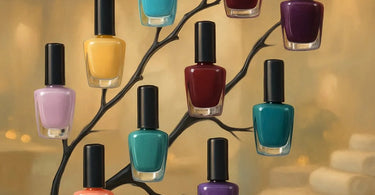
Solutions built for professionals like you... starting with the foundational knowledge that turns a good nail tech into a great one. Let’s talk color. Not just any color, but the glorious, sometimes confusing, world of nail polish hues. Imagine a client points to a picture and says, “I want that exact color!” but what they’re showing you is a muted, dusty rose and their brain is imagining a vibrant hot pink. This, my friends, is where a little family reunion comes in handy. Understanding the nail polish color family tree—its tones, shades, and undertones—is your secret weapon for perfect client communication, flawless color matching, and creating stunning, cohesive nail art that keeps them coming back. It’s the difference between “meh” and “more of that, please!”
Think of it like this: if color were a family, Hue would be the last name. It’s the broad category that everyone belongs to—the Reds, the Blues, the Greens. But within the Red family, you have a zillion different relatives. Some are loud and bold (Aunt Cheryl, who wears leopard print), some are soft and subtle (Cousin Emily, the yoga instructor), and others are deep and mysterious (Uncle Victor, who you’re pretty sure was in a spy movie once). Identifying the hue is just step one. The real magic—and the key to avoiding color mishaps—lies in understanding their specific personalities: their shade and tone.
Meet the Immediate Family: Hue, Shade, Tint, and Tone
Before we map out the whole family tree, let's get to know the key players living under the same roof. These terms are the building blocks of every color in your professional nail polish collection.
Hue: This is the pure color itself, straight out of the rainbow. It’s the first thing you see. Red, orange, yellow, green, blue, violet—these are all hues. When a client says “blue,” they’re referring to the hue.
Shade: Often used incorrectly to mean any color, “shade” has a specific job in the color world. You create a shade by adding black to a pure hue. This makes the color darker, deeper, and richer. Think of a classic burgundy or a navy blue. They are shades of red and blue, respectively.
Tint (or Pastel): The opposite of a shade! You create a tint by adding white to a pure hue. This makes the color lighter and softer, giving you all those beautiful pastels and baby colors. Millennial pink? That’s a tint of red. Powder blue? A tint of blue.
Tone: This is the real game-changer. Tone is created by adding gray to a pure hue. This “tones down” the color’s intensity, making it more muted, sophisticated, and complex. It’s the difference between a bright, fire-engine red and a dusty, mauve-tinged red. Most modern, trendy colors are all about their tone.
Branches of the Tree: The Major Color Families Explained
Now, let’s climb the main branches of our family tree. Each major hue family has its own distinct personality and sub-families that you’ll recognize instantly.
The Red Family: The dramatic, passionate branch of the tree. This family ranges from blue-based reds (think cherry, raspberry) that are cool and vibrant, to orange-based reds (coral, tomato) that are warm and fiery. Then you have your shades (burgundy, oxblood), your tints (pink!), and your tones (dusty rose, mauve). A classic longwear red nail polish is a must-have in any kit.
The Pink Family: Red’s extensive and popular offspring. Pinks can be neon-bright (a pure hue with high saturation), baby soft (a tint), or muted and earthy (a tone, like a “greige” pink). Understanding the undertones in pink—whether it leans more blue or more peach—is crucial for matching skin tones perfectly.
The Neutral Family: The sophisticated, minimalist relatives. This includes beiges, taupes, greiges (gray+beige), and nudes. These colors are almost entirely defined by their tone. The key to a perfect nude is matching the client's skin undertone (cool, warm, or neutral) with the polish's undertone. A warm skin tone will get lost in a cool, gray-based nude, and vice versa. This is where your consultation skills shine brighter than a professional LED lamp.
The Purple Family: The creative and royal branch. From lavender (a tint) to deep eggplant (a shade) to the currently hugely popular lilac and muted lavenders (tones), this family offers incredible range. It’s a fantastic choice for clients who want color but aren’t into anything too loud.
The Blue Family: The calm and reliable bunch. Navy is a shade of blue. Baby blue is a tint. Dusty cornflower blue is a tone. Blue-based polishes are generally considered “cool,” but a robin’s egg blue can have warm, green undertones that make it incredibly versatile.
The Green Family: The earthy, trendy family reunion that everyone gets invited to. Sage green? That’s a tone. Olive green? Often a shade with yellow/black added. Seafoam green? A tint with a lot of tone. Greens are complex and beautiful, perfect for creating nature-inspired looks.
Why This Family Tree is Your Best Business Tool
This isn’t just art class theory; this is practical knowledge that directly impacts your bottom line and client satisfaction.
1. Flawless Client Consultations: Instead of just holding up bottles, you can now speak the language of color. “So, I hear you like pink. Are you looking for something bright and cool-toned, or more of a warm, peachy, muted tone?” This immediately positions you as an expert and makes the client feel heard. It helps you manage expectations and ensures they leave with a color they adore, not just one they settled for.
2. Expert Color Matching & Custom Mixing: See a color on Instagram you don’t have? If you understand that it’s essentially a toned-down red with a hint of brown, you can likely mix it yourself using a base color and a bit of a complementary color or gray. This skill is pure gold. Stocking a range of mixing pigments can expand your palette infinitely.
3. Creating Cohesive & Artistic Designs: Knowing which colors are “related” (analogous colors on the wheel) helps you create gradients and nail art that are harmonious and pleasing to the eye. Contrasting colors from opposite sides of the wheel make for bold, statement designs. Your nail art rhinestones will pop even more when placed on a strategically chosen background color.
4. Building a Smart Inventory: When you’re looking to expand your professional nail care collection, you can think beyond just “we need more reds.” You can think, “We have three blue-based reds but could use a warm, orange-based one. We have dark shades but are missing a true, bright tint in this family.” This helps you build a balanced and comprehensive color offering.
Putting It All Into Practice: A Quick Guide
Next time a client is unsure, walk them through this simple decision tree:
Step 1: Pick a Hue. “Are you feeling a red, pink, neutral, etc.?”
Step 2: Decide on Darkness/Lightness. “Do you want it dark and dramatic (shade), light and airy (tint), or somewhere in the middle?”
Step 3: Determine the Vibe. “Should it be bright and clear, or more muted, dusty, and sophisticated (tone)?”
Boom. You’ve just navigated the entire family tree and found their perfect color match. And don’t forget the finish! A creamy gel polish, a shimmer, a metallic, or a glitter from your dipping powder systems can completely change the personality of a color. Pair that perfect color with a luxurious service using a paraffin wax treatment and some nourishing cuticle oil, and you’ve got a client for life.
So, go forth and explore your polish collection with new eyes. Introduce yourself to the loud reds, the subtle nudes, and the moody greens. The more you understand their family dynamics, the more you can create nail masterpieces that tell a beautiful story, one client at a time.