Efficiency redefined for modern professionals begins with creating client experiences that feel instantly familiar and deeply comforting. Let's be real, trying to explain color with technical jargon like 'muted tertiary beige' is about as exciting as watching polish dry. But what if you could describe your salon's new palette as 'espresso with champagne highlights' or your treatment room walls as 'soft cinnamon latte'? Suddenly, you're not just picking colors – you're curating an experience that clients can almost taste. This is the magic of using object-based color descriptions in your spa or salon, and it's about to become your secret weapon for creating spaces that clients instinctively understand and adore.
Think about the last time you tried to explain a color to a colleague. Did you say 'hex code #6F4C3E' or did you say 'rich espresso bean'? Exactly. Our brains are wired to understand the world through familiar objects, and leveraging this natural tendency can transform how you design your spaces, market your services, and even how clients feel the moment they walk through your door. It's like giving your color scheme a personality that everyone can immediately connect with.
Why Your Color Descriptions Matter More Than You Think
Color psychology isn't just academic theory – it's business strategy. Studies show that up to 90% of snap judgments about products can be based on color alone. When clients step into your spa, the colors surrounding them immediately begin influencing their mood, perception of your brand, and overall experience. Calming blues and greens can actually help lower heart rates and reduce stress levels, while warm neutrals create a sense of safety and sophistication. But trying to communicate these effects with technical terms? That's where we lose the magic.
Object-based color descriptions bridge this gap beautifully. Instead of telling a client they'll be receiving a treatment in a 'sage green room,' imagine describing it as 'surrounded by fresh eucalyptus tones.' The latter doesn't just describe a color – it evokes a scent, a feeling, a memory. It creates an entire sensory experience before the service even begins. This approach turns your color palette from mere decoration into a powerful storytelling tool that resonates with clients on a visceral level.
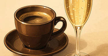
The Delicious Dictionary of Spa Colors: From Espresso to Champagne
Let's break down some of the most effective object-based color descriptions and how to use them in your spa or salon. Each of these tones brings its own psychological benefits and practical applications that can enhance different areas of your business.
Rich Espresso Tones: Grounded Sophistication
Espresso isn't just for morning pick-me-ups – it's for creating spaces that feel deeply grounded and sophisticated. These rich brown tones, like those of freshly brewed coffee, convey stability, warmth, and organic elegance. Think dark wood manicure stations, chocolate-brown walls in your waiting area, or espresso-toned spa furniture. Espresso colors work particularly well when balanced with lighter accents, creating a sense of depth and luxury that makes clients feel pampered and secure.
Psychological impact: Espresso tones are inherently grounding and comforting. They create a sense of stability and warmth, making them perfect for areas where you want clients to feel secure and cocooned. Pair these deep browns with creamy vanilla accents for a balanced, inviting atmosphere that feels both luxurious and approachable.
Champagne Hues: Effervescent Elegance
Champagne colors bring that celebratory feeling into everyday treatments. These soft, shimmering neutrals with warm undertones suggest luxury, celebration, and refined elegance. Imagine champagne-colored towels, pale gold accent walls, or metallic champagne details on your reception desk. Unlike harsh bright whites, champagne tones add warmth while maintaining sophistication, creating spaces that feel special without being sterile.
Psychological impact: Champagne hues evoke feelings of celebration and luxury. They're perfect for creating that 'special occasion' feeling that keeps clients coming back. Use these tones in areas where you want to maintain brightness while adding warmth, like treatment rooms or pedicure stations. They pair beautifully with deeper espresso tones for contrast or with soft blues for a fresh, airy feel.
Cinnamon Spice: Warm Invitation
Cinnamon tones bring warmth, energy, and comfort to your spaces. These reddish-brown hues are inherently inviting and stimulating – perfect for areas where you want to encourage conversation and energy. Think cinnamon-colored walls in your styling area, terracotta accents in your retail space, or warm spice tones in your stylist uniforms. Cinnamon works particularly well when you want to create warmth without the intensity of pure red.
Psychological impact: Cinnamon colors are naturally stimulating and comforting – the visual equivalent of a warm hug. They're ideal for social spaces within your salon or spa, like waiting areas or styling stations. These tones can help create an environment that feels both energetic and nurturing, encouraging clients to relax and open up during their services.
Vanilla Cream: Soft Serenity
Vanilla cream tones provide the perfect neutral backdrop that lets other colors shine while maintaining a sense of calm simplicity. These soft off-whites are far more inviting than stark white, creating warmth without overwhelming the senses. Imagine vanilla-colored walls throughout your spa, creamy spa bedding, or soft beige therapist uniforms. Vanilla cream works beautifully as a base color that allows your accent colors to pop while maintaining an overall sense of tranquility.
Psychological impact: Vanilla tones are inherently calming and comforting. They create a blank canvas that feels safe and serene, making them perfect for treatment rooms where clients need to fully relax. Unlike clinical white, vanilla cream maintains warmth while still feeling clean and professional.
Mixing Your Palette: Creating Harmonious Color Stories
The real magic happens when you combine these object-based colors into cohesive stories that guide clients through your space. Think of your color palette as a narrative that unfolds as clients move from area to area, each with its own purpose and emotional tone.
For your reception area, consider an 'Espresso & Champagne' combination that makes a sophisticated first impression. Rich espresso tones on feature walls or furniture grounds the space, while champagne accents on lighting fixtures or accessories add brightness and elegance. This combination immediately communicates quality and attention to detail.
In treatment rooms, a 'Vanilla & Cinnamon' story creates warmth and comfort. Vanilla walls provide a serene backdrop, while cinnamon-colored massage bolsters or accent pieces add just enough warmth to make the space feel nurturing. This combination is particularly effective for spaces dedicated to relaxation and rejuvenation.
For social areas like styling stations or nail bars, a 'Champagne & Espresso' mix maintains energy without chaos. Champagne-toned stations or furniture keeps the space feeling bright and airy, while espresso accents on cabinetry or flooring provide definition and sophistication. This balance helps maintain professionalism while encouraging the social interaction that makes salon visits enjoyable.
Practical Application: Bringing Your Color Story to Life
Now that you're inspired by these delicious color descriptions, how do you actually implement them in your spa or salon? Start with your brand identity and the specific emotions you want to evoke in each area of your business.
Begin by auditing your current space with fresh eyes. What story are your current colors telling? Does your reception area feel as inviting as you want? Do your treatment rooms genuinely promote relaxation? Identify areas that need improvement and consider which object-based colors could enhance the client experience in those spaces.
When selecting materials and finishes, use your object-based descriptions as a guide. Looking for new massage tables? Consider espresso-toned vinyl for a grounded, luxurious feel. Updating your pedicure chairs? Champagne-colored upholstery can make every client feel like they're being pampered. Even small touches like cinnamon-toned applicators or vanilla-colored cotton products can contribute to your overall color story.
Don't forget about your retail areas! The colors in your retail space can significantly impact purchasing decisions. Use warm, inviting tones like cinnamon around skincare products to encourage browsing, or sophisticated espresso tones to highlight luxury items like premium brand collections.
Talking Color with Clients: The Language of Experience
The beauty of object-based color descriptions extends beyond your physical space into how you communicate with clients. When describing services or creating marketing materials, use this same language to help clients visualize their experience.
Instead of promoting a 'neutral-toned relaxation area,' talk about 'vanilla and cinnamon waiting nooks.' Rather than describing 'earth-toned treatment rooms,' invite clients to 'unwind in our espresso and champagne sanctuary.' This language doesn't just sound better – it creates immediate emotional connections that technical descriptions can't match.
Train your staff to use this color language when guiding clients through your services. Aestheticians can describe facial treatments as 'wrapping you in vanilla warmth' or nail technicians can talk about creating 'espresso-inspired nail art.' This consistent color storytelling reinforces your brand identity at every touchpoint.
Color Consistency: Maintaining Your Palette Across All Elements
Creating a compelling color story is one thing – maintaining it consistently across all aspects of your business is another. Your object-based palette should extend from your physical space to your marketing materials, online presence, and even your service descriptions.
When updating your website or social media, use photography that reflects your color story. Showcase your espresso-toned salon furniture against vanilla walls, or feature your champagne-colored towel steamers in action. Use your color language in captions and descriptions to reinforce the sensory experience you're creating.
Even your product selection should reflect your color philosophy. Choose gel polish colors that fit within your overall palette, or select aromatherapy supplies with packaging that complements your space. Every element, from your nail art supplies to your cleaning products, contributes to your overall color story.
The Sweet Spot: Balancing Trendy and Timeless
While object-based color descriptions help create immediate emotional connections, it's important to balance trendy names with timeless appeal. 'Espresso' and 'champagne' have enduring sophistication, while some food-inspired color names might feel dated in a few years.
Stick with object descriptions that have proven staying power and universal appeal. Natural elements like espresso, champagne, cinnamon, and vanilla have stood the test of time because they connect to fundamental human experiences of comfort, luxury, and warmth.
Remember that your color story should evolve with your business while maintaining its core identity. As you refresh different areas of your spa or salon, you might introduce new accent colors or update your palette slightly, but your foundational color language should remain consistent enough that clients still recognize and connect with your brand.
Brewing Your Perfect Color Blend
Transforming your spa or salon with object-based color descriptions isn't just about aesthetics – it's about creating spaces that feel instinctively right to clients. When you describe your walls as 'cinnamon spice' rather than 'terracotta beige,' or your furniture as 'espresso rich' instead of 'dark brown,' you're not just being creative – you're tapping into deep psychological connections that make your space feel more welcoming, memorable, and effective.
The best part? This approach costs nothing to implement but can transform how clients experience your business. So go ahead – brew up some espresso tones, sprinkle in cinnamon warmth, and toast your success with champagne elegance. Your clients will not only notice the difference – they'll feel it in their bones, even if they can't quite articulate why your space feels so perfectly... you.
Ready to bring your color story to life? Explore our complete range of spa equipment and furniture to find the perfect pieces to express your unique palette. From portable massage tables to manicure stations, we have everything you need to create a space that tells your color story beautifully.
%20to%20Describe%20Tones%20and%20Transform%20Your%20Spa%20Client%20Experience)