
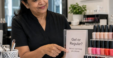
Because details matter... especially when it comes to making a sale! Let me paint you a picture: a client walks into your serene spa or buzzing salon, they are relaxed, happy, and ready to spend. Then, they are confronted with a retail display that looks like a ransom note written by a committee of squirrels. There are 47 different signs, each screaming a different message, all fighting for attention. The result? Their eyes glaze over, their brain short-circuits, and that impulse purchase you were banking on goes right out the window. They leave with nothing but a confused look on their face. We have all seen it happen, and we have probably all done it ourselves.
Listen, we get it. You have an incredible range of products—from the latest lash and brow enhancements to the most luxurious massage oils—and you want to tell your clients about every single one. But here is the hard truth that will save your sanity and your bottom line: your retail signs are a mess, and it is costing you money. The secret to a successful small retail display in your spa or salon is to follow one simple, golden rule: your sign should answer one question and one question only. If your sign is trying to sell everything, it is effectively selling nothing.
The Overwhelming Reality of Sign Clutter in Your Spa or Salon
Think about your own shopping habits for a second. Do you like being bombarded with a million different pieces of information at once? Of course not! Your clients are the same. They are coming to you for a relaxing experience, not a mental marathon. When a retail display is covered in conflicting messages, it creates 'signage clutter' . This clutter makes potential buyers feel overwhelmed and, more often than not, they just tune the whole display out and walk away.
You cannot see any one message if they are all fighting to be the loudest. As business owners, we have to remember that a sign is meant to guide, not confuse. A hard-to-read font, conflicting colors, or a sign that tries to explain the benefits of a sunless tanning product while also detailing the results of a microdermabrasion treatment and the price of a pedicure chair is a recipe for disaster. If a customer cannot read and understand your sign in seconds, it has failed at its one job.
The Golden Rule: One Question, One Sign
So, what is the one question your sign should answer? It depends entirely on what is sitting next to it! The key to retail success is simplicity. Each sign you place in your spa or salon should have a single, crystal-clear objective. It should be designed to answer the single most important question a client has about that specific product at that specific moment.
Scenario 1: Addressing "What is this and why do I need it?"
You have a fantastic new advanced facial treatment product on your shelf. Its benefits are immense, but the packaging might look a little clinical or confusing to the untrained eye. Your sign needs to cut through that confusion. It should answer the question, "What is this magical potion and what will it do for my skin?"
It is about context and adding value . Think of it like a "Staff Pick" or a "Best for Sensitive Skin" note. By providing a clear, simple explanation of the product and its key benefit, you empower your clients to make a decision, even if you are busy with another client .
Scenario 2: Announcing "Is this on sale? How much does it cost?"
There is nothing more frustrating for a shopper than having to track down a price tag. If you have a dedicated display for your ItalWax products, your sign should make the price and any promotions instantly visible. This is where you can answer the direct question, "How much is this, and is there a deal?"
Uncertainty about price is one of the biggest reasons a client will hesitate and not buy . If they see a sign that clearly says, "Buy 2 ItalWax Hard Waxes, Get 1 Pre/Post Product Free," you have just removed the guesswork and created an instant, compelling reason to purchase.
Scenario 3: Guiding a Client to "Where can I find what I need?"
Have you ever had a client looking for a specific product but they were too shy to ask? That is where good directional signage comes in. It answers the simple question, "Where is this?"
You can create small, subtle signs that guide your client to specific sections of your retail area. A small plaque that says "New Arrivals" or "Gift Sets" can help a shopper navigate your space with confidence, making them feel more comfortable and likely to stay longer .
How to Apply This to Your Spa or Salon Retail Displays
Ready to declutter your retail space and watch your sales soar? Here is how to put this one-question rule into practice.
1. Audit Your Current Chaos
Take a hard look at your current retail displays. Be brutally honest. Are your signs creating an inviting atmosphere, or are they just adding to the visual noise? If a sign has more than two sentences, it is too long. If it is trying to sell a sugar scrub, the benefits of the spa body treatment, and a promotion on aromatherapy supplies, it is too much. Start by removing every sign that is confusing, faded, or outdated. This is just like maintaining the rest of your business; you would not use outdated products in a service, so why would you display an outdated or messy sign?
2. Design for Simplicity
When you create your new, lean signs, keep the design clean and easy to read. Do not use a fancy font that is hard to decipher. High contrast colors are your friend. Think of it like this: you want your sign to be the hero of the hygienic table paper of your retail space—clean, functional, and essential.
Choose a high-quality material that reflects your brand. A professional salon would not use cheap equipment, so do not use cheap-looking signs. Foam core is a great, affordable option for short-term displays, while something more durable like acrylic is a fantastic, professional finish for long-term use .
3. Create a Visual Path with "Hero" Signs
Think of your retail space as a journey. You want to guide your client from the entrance to the checkout counter, exposing them to as much of your inventory as possible . A "hero" sign—a large, bold, single-message sign—at the entrance of your retail area can pull them deeper into the space. It is not trying to sell the details; it is simply saying, "Hey! We have some incredible new stuff in here. Come take a look!"
Maybe this hero sign highlights a new professional wax warmer or a collection of luxury spa furniture. It creates a visual path and encourages movement, exposing them to more opportunities to shop.
4. The Power of the Upsell and Cross-Sell
This is where the one-question rule truly shines and makes you money. Imagine a client has just purchased a towel steamer for their treatment room. What is the one question they might have next? "What else do I need for this?"
Your sign right next to the steamer should answer that single question. It does not need to detail the entire history of the steamer. It should simply say, "Complete your experience with our premium, extra-thick high-quality towels," and maybe, "Bundle and Save!" It is a direct, clear, and compelling answer to a specific question that increases your average order value.
5. Seasonal and Promotional Clarity
The one-question rule is just as important for your temporary signage. When you are running a promotion on professional hair color or updating your retail for a summer theme, your signs need to be clear and urgent.
A sign that says "Summer Sale!" is okay. But a sign that says "Get Beach-Ready: 20% Off All Professional Sunless Tanning Equipment" is better. It answers two questions at once: "What is the theme?" and "What is the deal?" It is specific, it is actionable, and it is compelling.
Real-World Examples of The One-Question Rule in Action
Let's bring this home with some real-world examples from the spa and salon industry.
- For a Waxing Station: Instead of a sign that says, "We sell wax and stuff," create a sign next to your professional wax spatulas and applicators that answers the question, "How do I get the perfect application?" The sign could say: "For Smooth Results: Use a new spatula for every client. Our applicators and spatulas ensure hygiene and precision."
- For a Nail Art Display: A display of vibrant nail art rhinestones is exciting but overwhelming. Place a sign that answers the question, "How can I use these?" The sign could show a small picture of a finished design and say: "3D Sparkle Effect: Add one of a kind glamour to your professional gel polish manis with our new crystal collection."
- For a Massage Therapy Product: You have a shelf of massage oils, lotions, and creams. A client might be wondering, "Which one is best for a deep tissue massage?" Your sign next to the Biotone collection could answer that with: "For Deep Tissue: Our Biotone creams provide exceptional glide and are infused with arnica for muscle relief."
Conclusion: Less is More, and More is More Money
The takeaway here is simple: in the world of small retail signs, less is absolutely more. The more focused and specific your message is, the more effective it will be at converting browsers into buyers. By adhering to the golden rule of answering one question at a time, you are not just selling a product; you are solving a problem, providing guidance, and enhancing the overall client experience.
So, go ahead, take a deep breath, and grab a trash bag. It is time to declutter those displays! Start fresh with a simple, clear, and compelling message for each product or display. Your clients will thank you for the clarity, your retail team will thank you for the easy sell, and your bank account will thank you for the boost in sales. Remember, a confused client is a non-buying client. A clear client is a happy, shopping client!
